Tradle
Visual exploration & branding for a new platform
During my internship at Hike One, I aimed to learn how to conduct a visual exploration of a brand. I wanted to understand where to start, what steps to take, and how to experiment effectively.
Thanks to excellent guidance, I learned all of this. The first step was defining the brand itself: What kind of feeling should it convey? And for which platform was the visual exploration intended?
This phase was largely about experimentation. I explored whether certain colors worked, tested different typography, and defined the shapes. It was an enjoyable process; some ideas succeeded, others didn’t. By the end, I had developed multiple versions of visual explorations.
.png?u=https%3A%2F%2Fimages.ctfassets.net%2Forwvh3yevko1%2F7ztUSu9jTt9AHOYGsnrt8g%2F7edab95e7ecbd168728c74f2b1a73868%2FStyle_Tile__Black___White_.png&a=w%3D250%26h%3D182%26fm%3Dpng%26q%3D75&cd=2022-08-18T12%3A55%3A54.790Z)
.png?u=https%3A%2F%2Fimages.ctfassets.net%2Forwvh3yevko1%2F1gJg4e6W89c3kujNArk1Dr%2Fc507f31563f06712d5cfa790dc84a824%2FStyle_Tile__Miami_.png&a=w%3D250%26h%3D199%26fm%3Dpng%26q%3D75&cd=2022-08-18T12%3A56%3A19.912Z)
.png?u=https%3A%2F%2Fimages.ctfassets.net%2Forwvh3yevko1%2F21wykrrtPwIIwwKMp0i0dS%2Fbd764e7b64530021a9c1248729ff3d7c%2FAesthetic_Old__Purple__Blue_.png&a=w%3D250%26h%3D182%26fm%3Dpng%26q%3D75&cd=2022-08-18T12%3A57%3A07.386Z)
Creating these visual explorations was enjoyable, but what is also crucial for a company is a logo. I have always wanted to learn how to design an effective logo. Logo design is a complex skill and a profession in itself, but I wanted to give it a try. The more I learn about design, the better I can become.
The first step involved sketching and observing the real world. I looked for objects and patterns, noting the similarities I could find. By creating a recognizable logo, people can understand and connect with your company much more easily.
After the sketching phase, I focused on experimenting with the initial ideas. I created different shapes, explored various typographies for the logo, and tested multiple combinations. After several revisions, I arrived at a finalized concept.

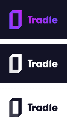
I also created multiple versions of the logo to ensure it worked on different backgrounds. Additionally, I learned about kerning, a detail I had never really considered before.

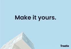
Finally, the logo should be applied to billboards and promotional social media posts to ensure consistent branding across different platforms.


It was an enjoyable assignment that taught me a great deal about the design process involved in creating a visual exploration for a company. I still have much to learn, but this served as a valuable first exercise.