CocoCraze
A new package design for delicious chocolate
For one of the courses during my exchange at TMU, I was assigned to create a new packaging proposal for an imaginary product. The course, titled Introduction to Packaging, focused on the fundamentals of package design, manufacturing, materials, and sustainability. We worked in groups, and within my team, I took responsibility for the branding and design of the new package, while other members focused on audience research, materials, product requirements, and promotion.
In the early stage of the assignment, my group and I brainstormed until we decided to create a candy-related product. We agreed on developing a chocolate candy bar aimed at a millennial audience. The new packaging needed to not only compete with existing chocolate brands but also establish a unique identity of its own.
I began by researching online for inspiration, collecting images of various chocolate brands to gain a better understanding of the market and how our packaging could fit within it. At the same time, I worked on naming our chocolate brand and quickly settled on "CocoCraze," combining "cocoa" and "craze" to evoke excitement and trendiness. I then experimented with different color schemes and typography combinations to develop the brand identity. After multiple iterations, I was satisfied with the final result.
The chocolate spots, brand name, and color palette give the packaging a playful and simplistic look, helping it stand out in the crowded market. Since this course took place at TMU in Canada, one of my team members suggested tailoring the design for Canadian consumers. We decided to feature artwork from Canadian painters on the package. The final design of the front of the package looked like this:
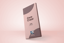
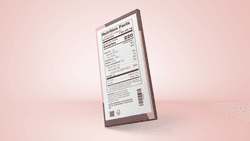
The package also had to meet specific requirements. The nutrition label needed to be clearly readable, and other essential information, such as a barcode and allergy warnings, had to be included as well.
I also created some mock promotional designs to envision how our product could be launched and marketed on social media.
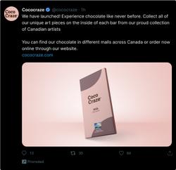
Because I took the time to clearly define the branding of our product, I was able to seamlessly apply it across our presentation, documents, and the overall product experience.
Colors
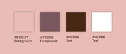
Typography

In the end, my group and I were proud of the final result. We received a grade of 8 for our project, and I completed this course during my exchange.